
Set up Direct Deposit UX
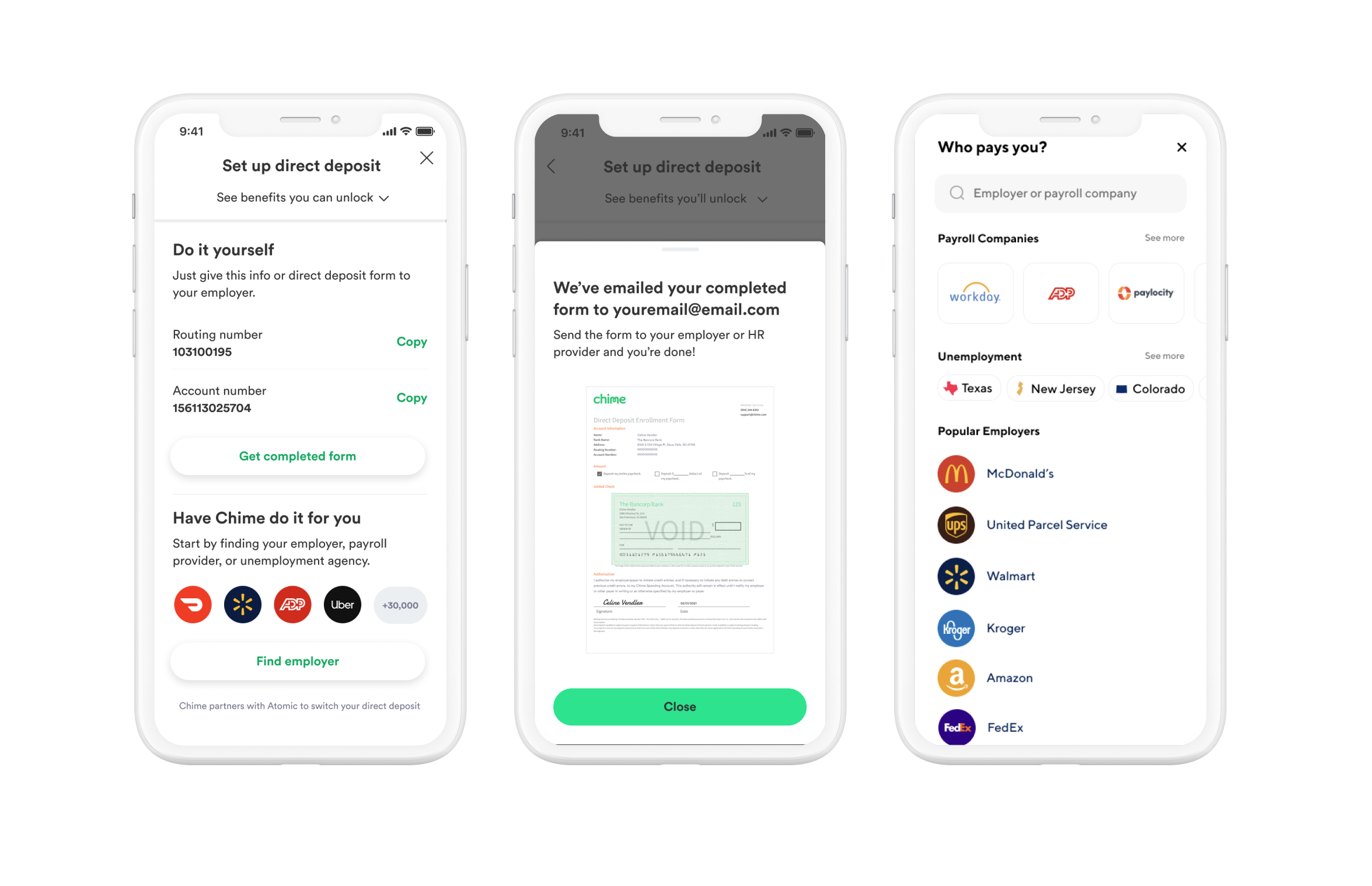
My role: UX, UI, product design, strategy, user testing, & experiment design
Team:
Product Designer
Product Manager
Researcher
Analytics
Engineering team
Content Designer
Problem:
Today, we offer members two discrete direct deposit set-up experiences: ASE (automatic set up) and manual switch - by default we first send members through ASE. Atomic’s coverage is limited to 100,000 employers so when members don’t find their employer and drop off we take them to manual. Currently members have to fill out the form and send it to employer. ASE doesn’t work for everyone but for the people it does work for it works well but there are still a good amount of members who can’t find their employer through Atomic or would rather give their numbers or form to their employer instead.
Hypothesis:
From past surveys, recent user testing, and actual direct deposit set-up distributions between ASE (15%) and manual (85%), we know that the majority of our members expect and need to set up manually, either using their routing and account numbers or their direct deposit form. Enabling members to choose and go through the best flow for them right off the bat will decrease friction and increase conversion in DD set-up.
Results:
- +2.7% 30DD conversion rate
- +3% Late stage DD 5-25 weeks
- +8% late- stage DD 26-52 weeks
- +23.4% DD set-up finish rate vs. previous was +10.5% lift
Control Experience
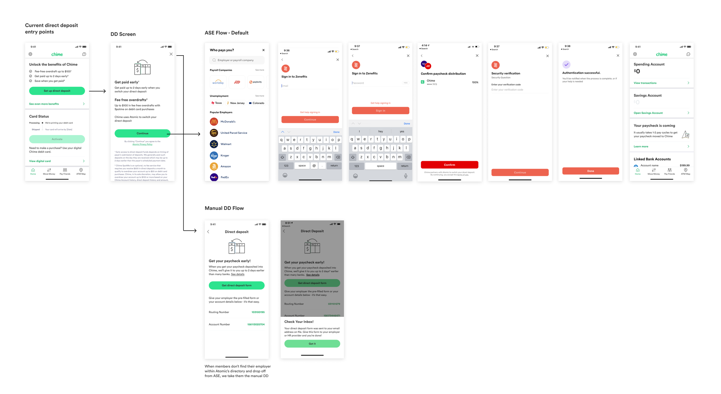
Unnecessary friction to go through Atomic if not the right experience.
No immediate access to routing and account numbers or DD form if the preferred experience
No context after dropping off the ASE experience
Design Concepts
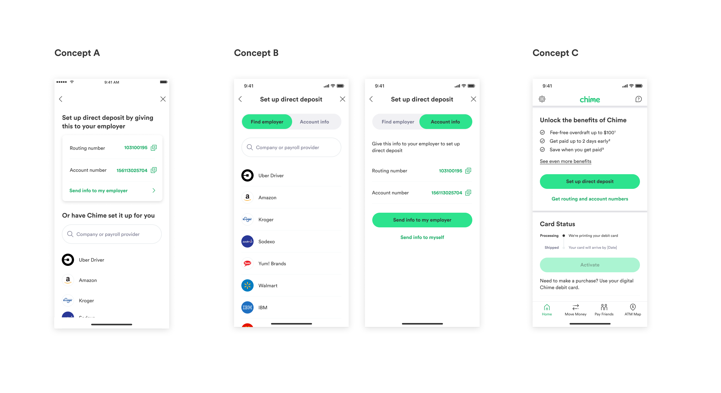
Concept B: Knowing we can provide the automatic switch experience for many of our members, we want to highlight that experience while also giving members outside the reach of ASE other options to set up.
Concept A: By clearly and prominently presenting each direct deposit set up pathway in one screen, we empower members to set up DD the way they want to.
Concept C: We know a lot of our members plan to set up DD using their account numbers so by giving these high intent members immediate access to their account and routing numbers on the home screen, we streamline their DD set up experience.
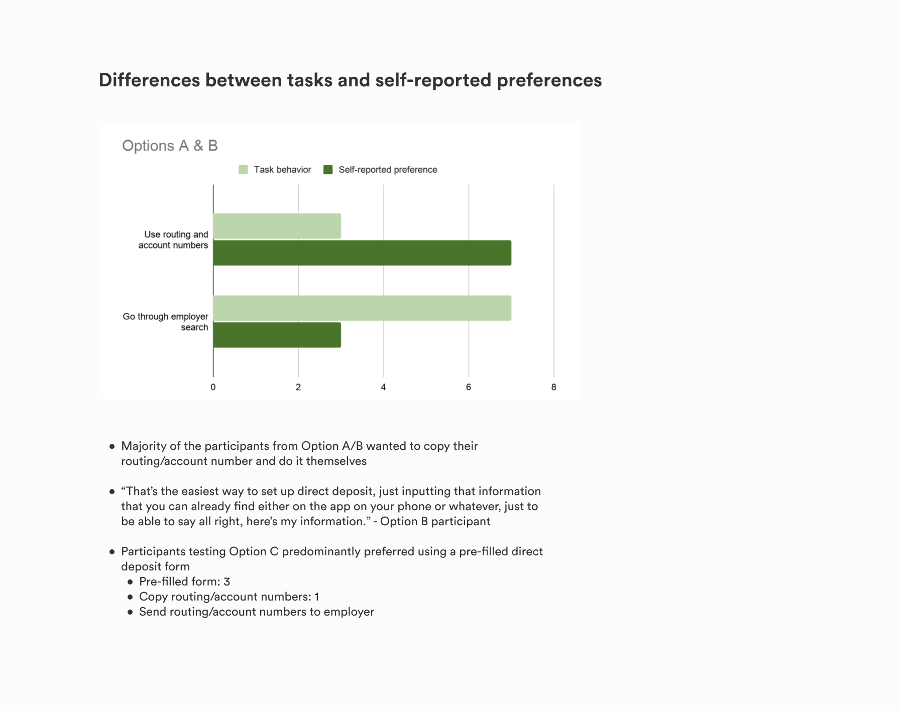
User Testing Results
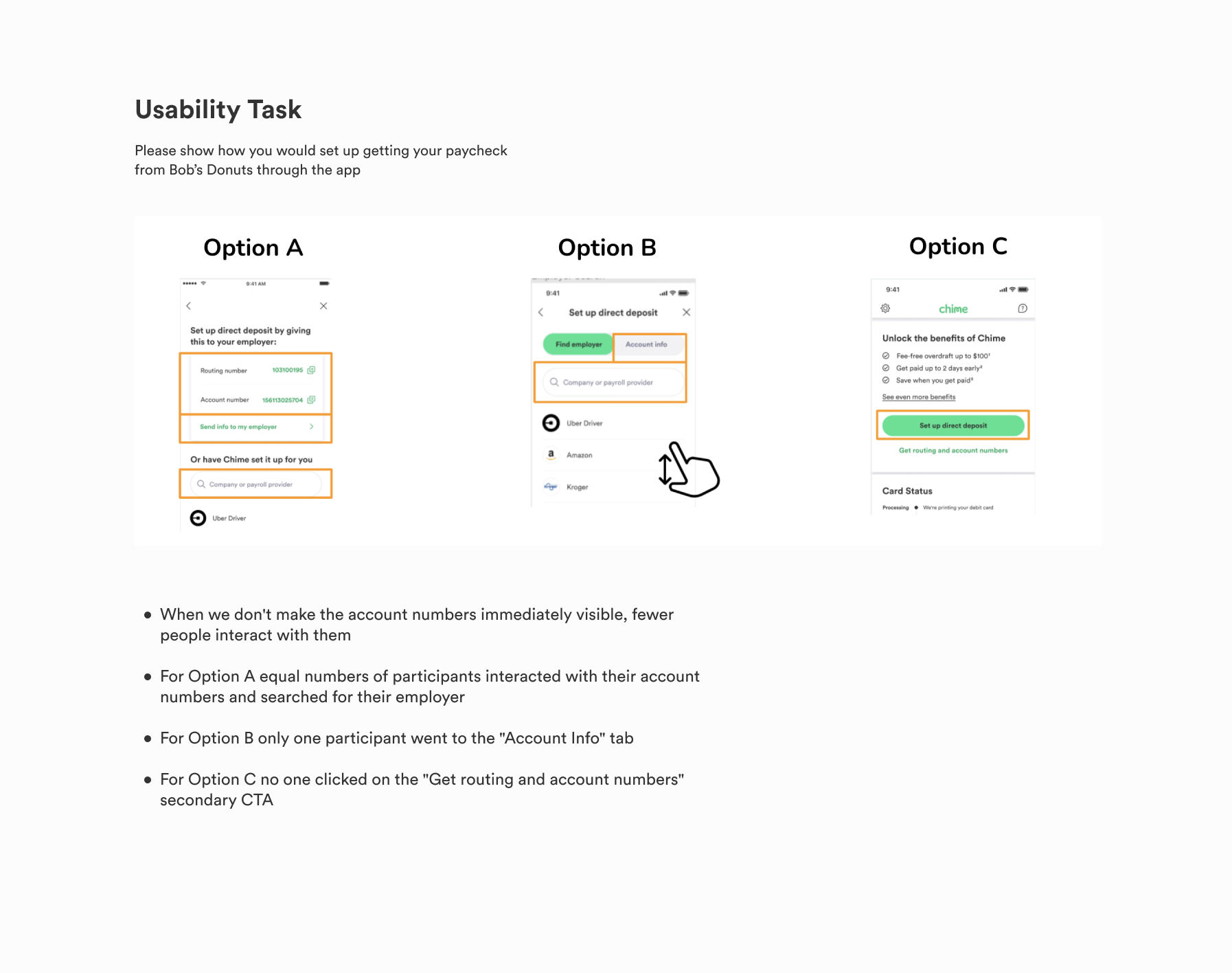
MVP Designs
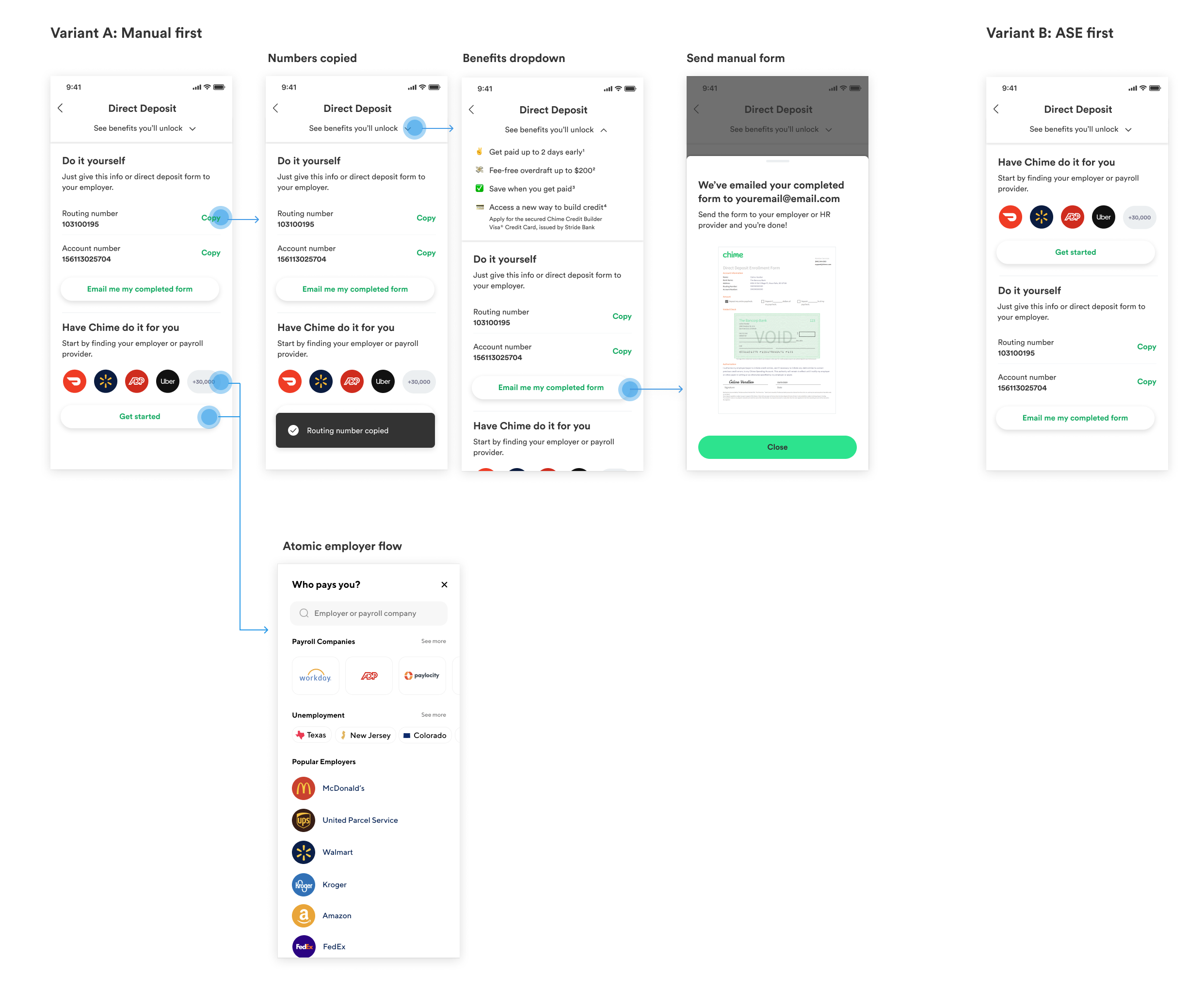
We tested two variants of the screen. Variant A: Starting with manual first option and Variant B: Starting with ASE first. Based on this result we would add a primary button and see what the impact would be. We tested a shortened version of the manual DD flow and really cut down the steps to fill out the form. This performed well and decided to use this across the board.
Follow up Polish Tests
We did two follow up experiments. One where we tested adding primary CTA to manual first option since that performed the best to follow our designs systems and the second experiment to tighten up the button copy to be simple and clear.
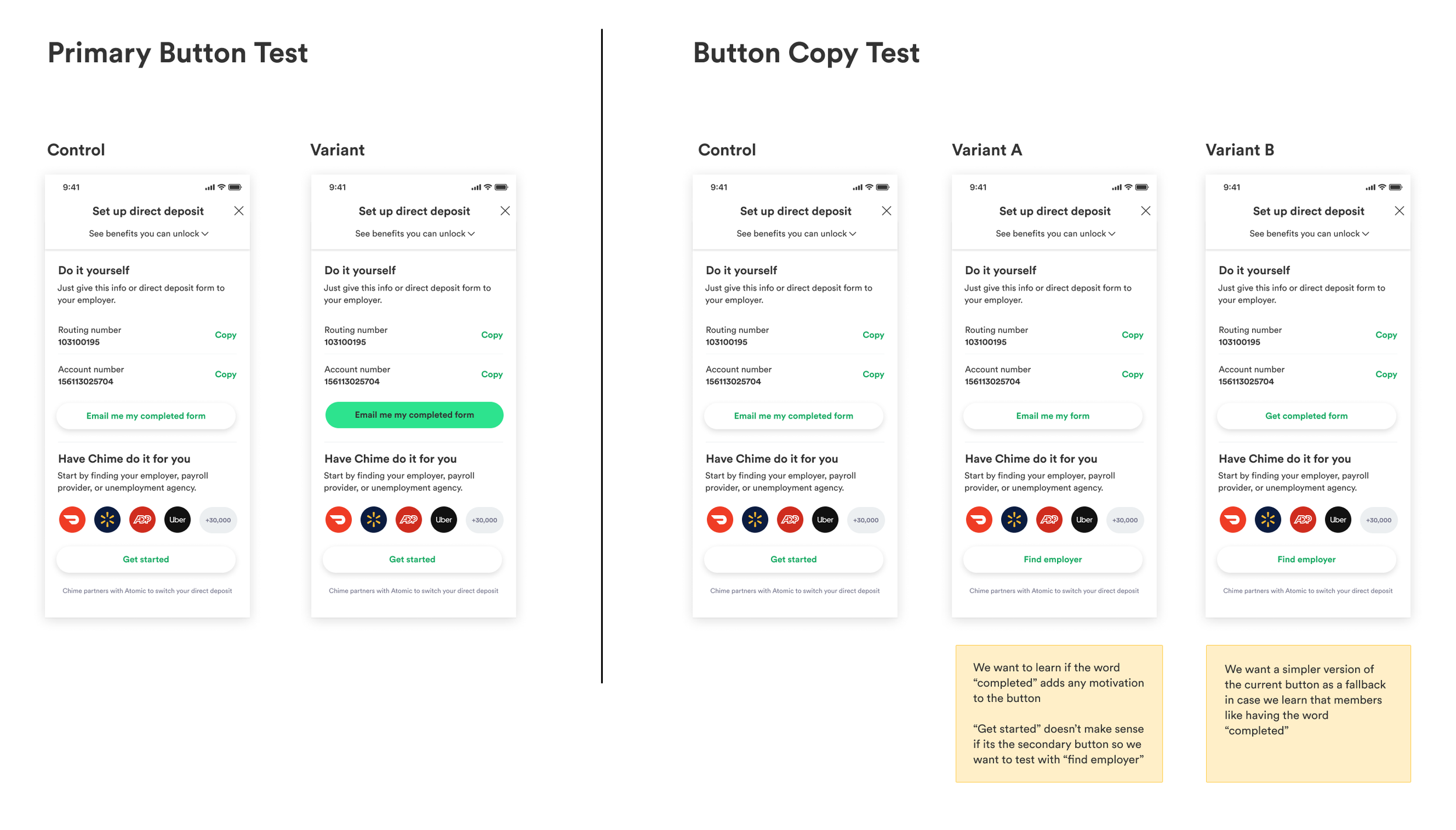
CTA Test:
Results were neutral, we moved foward with variant B
Button Test Results:
Control had an overall 1% life in DD 30D Conversion, more people tapped on ASE (1% more)
We thought adding primary button would increase conversion and tap starts but that wasn’t the case
Some of the assumptions were that members don’t want more guidance in choosing how they want to set up their DD. Based on research people know what the options are and they want to make their own decisions. We tested the ordering and saw manual performed well, the ordering may be enough
Making the button green adds more complexity to the screen. Simple might be better since there’s already so much going on in the screen.
Set up DD Vision: Employer Search
Impact:
This project let me view the DD set up experience as a whole acknowledging members after setting up and applying learnings from past experiments to this larger experience
PM & I created the strategy together in making the DD process more personalized & customizable. We created a documentation of what the short & long terms could be stemming from this project.
I ended up designing 5 phases in order of how we could launch each experience and handed it off to the team while I transitioned to Retention.
Expanded the Unified DD designs to fit this system
Context:
The goal was to build out a search engine for the DD set up experience and to make it intuitive and personalized with the best DD set up recommended path based on the member’s employer. Another goal was to make sure there were no dead ends depending on which path members took.
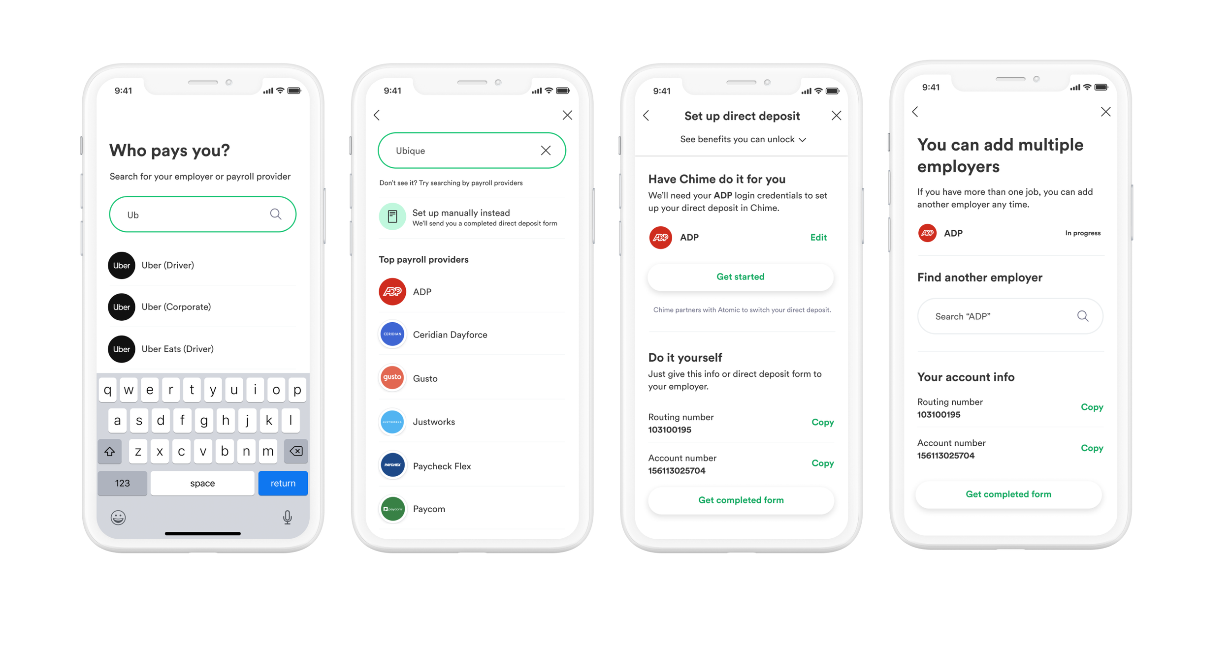
The goal was to create a native employer search on app and navigate members to the right set up based on where they work. If we know their employer is supported by ASE we would route them to that experience making the set up easy, but if we don’t support their employer we would showcase an option to set up manually instead. The third screen shows what the DD screen would look like if we got members employer data in onboarding. The last screen shows the ability to add multiple DDs since we see many of our members having multiple jobs and direct deposits.
Unfortunately we weren’t able to test this due to shifting priorities but an aspect of this is being built out by another team.